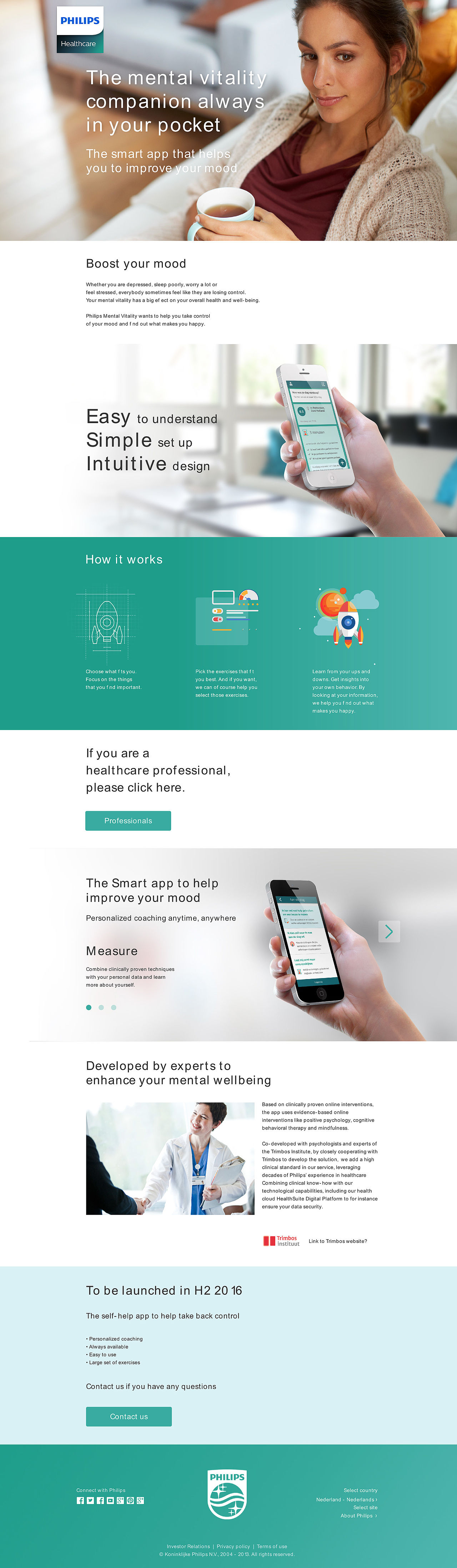
Philips mental health
Within the Philips Mental Vitality team, we created an app
to help patients that suffer from depressive complaints.
The app supports patients by providing them with more information
for self-reflection and patients receive a personalized program
to help them work on four attention areas:
depressed mood, rumination, stress, and sleep.
To comply with my non-disclosure agreement,
I have omitted and obfuscated
confidential information in this case study.
The information in this case study is my own
and does not necessarily reflect the views of Philips.
LAUNCHING WEBSITES
My prototypes websites were built to launch the app at the health week 2016 in Eindhoven. One website for clients and one for GP’s.
MY ROLE
I was brought in the project because the app wasn’t useable enough. The project already existed for a year. We were looking for more usability and shorter ways to get somewhere. User research had been done. Now it was time to translate data into usable interfaces. I was responsible for the architecture and functionality of the iOS and android app and launching websites. I worked alongside the UX lead who focused on the experience strategy and visual design.
Responsible for the user experience of all major deliverables and presenting these to the client and GP, at the global presentation at the healthcare week of June 2016. Information architecture, ease of use, efficiency and effectivity, prototyping.
The challenge
FEELS LIKE A CONVERSATION
The new experience concept feels like a conversation without looking like one.
– Mediate a conversation on one central screen
– Guide people with a clear onboarding process
– Support our service becoming a habit for people
The app had too long routes. A better user experience: simple, efficient, and effective. A new experience concept to address this feedback received from users during testing.
The app is a unique combination of several innovations:
– adapts to patients needs and progress
– is complaint-driven
– provides stepped care: light modules if possible, intensive modules if need
– is data-driven, takes patient and context data into account
– well designed for user experience and usability
– designed and developed as a medical device
The approach
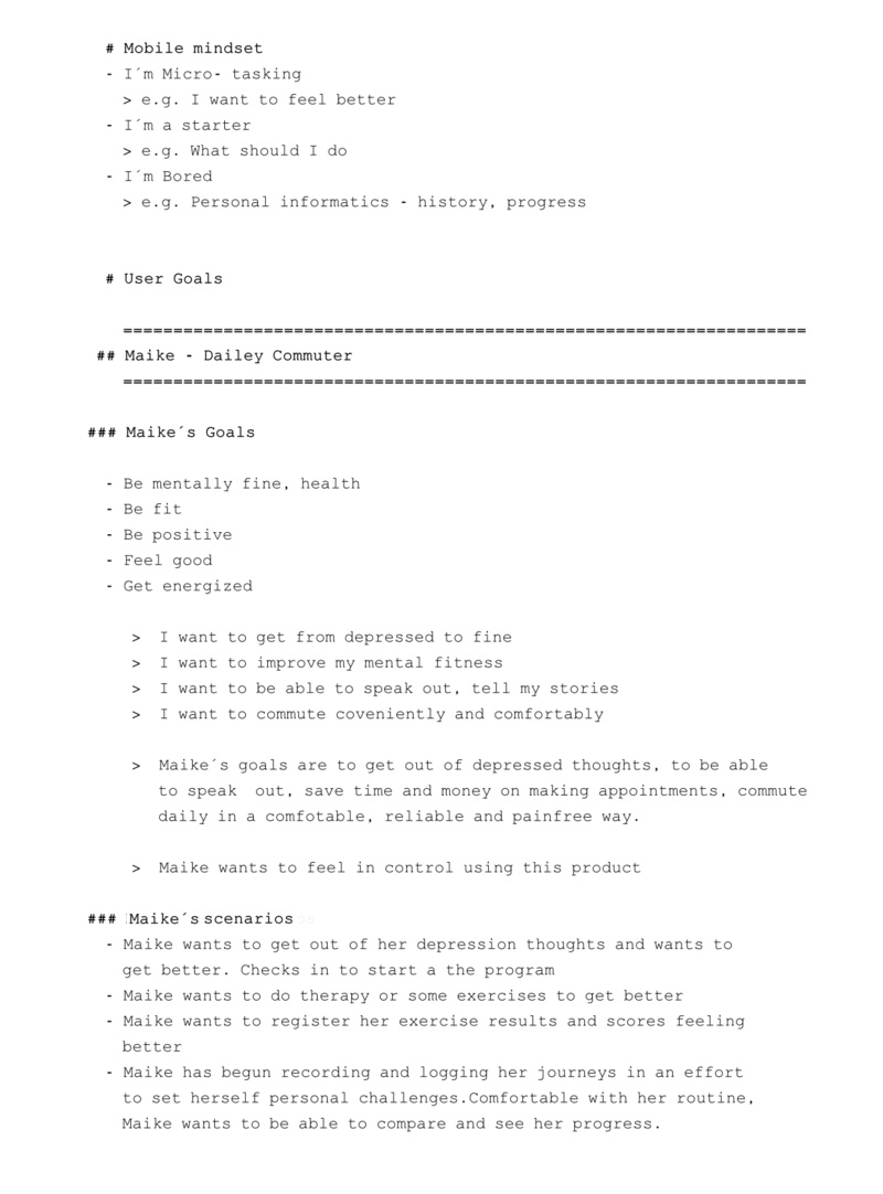
USER RESEARCH
We did qualitative user research by testing with users and interviewing them. We had a panel of 10 persons. The target group. They were all a little depressed.
All reports and insights were discussed with a team of researchers.
There was a user researcher/MD who facilitated the meetings. Affinity maps were put together and there was instant feedback.

AFFINITY GROUPS
Similar ideas were clustered together. Each affinity group was given a clear title describing the overall concept.
CONCEPTS ELABORATED
Then each affinity group was elaborated and refined with supportive ideas into concepts.
Actionable ideas were separated from vague ideas.
PITCH AND SELECT
Concepts were presented, e.g. in an
elevator pitch format. The most promising concepts were evaluated and selected, e.g. via dot voting or rating matrix.
The discovery
DESIGNING FOR WHAT USERS WANT TO KNOW DO & FEEL
Synthesizing goals from the research served as a lens through which to consider not only what the app should do, but also how it should feel. We believed this would be the difference between delivering a good experience and a great one. Thinking about emotional design helped our client understand the importance of aesthetics and tone of voice to the experience.
Keeping the scenarios at a high level allowed us to work fluidly and explore concepts that we could easily communicate with our team and client. They formed the backbone of our requirements and allowed us to express these from both a functional and emotional perspective allowing for further empathy with our users.
The framework
SETTING THE DESIGN DIRECTION
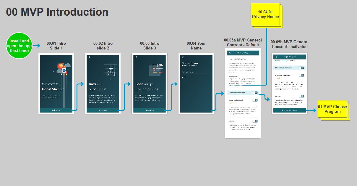
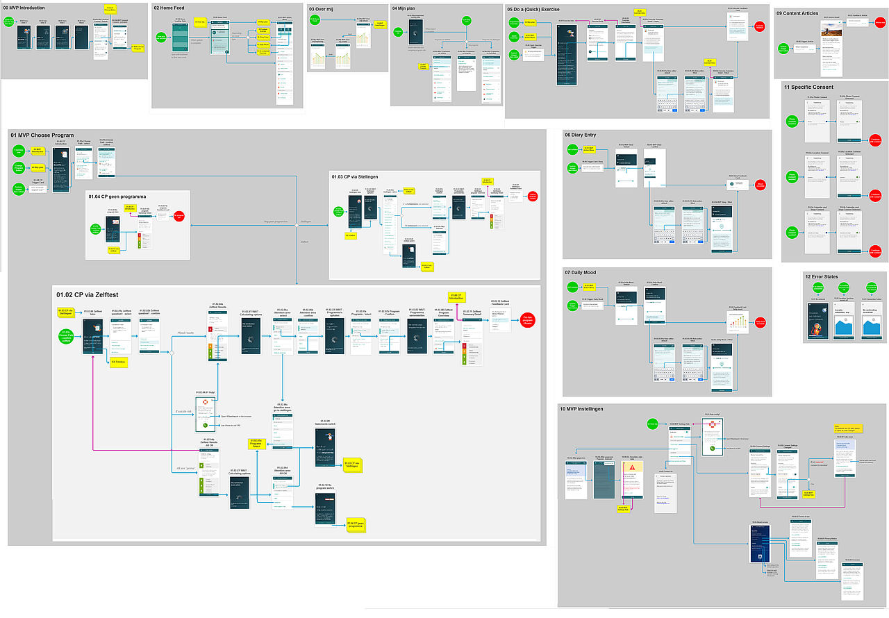
First I worked out de seperate flows. Like this intro, installing and open the app for the first time.
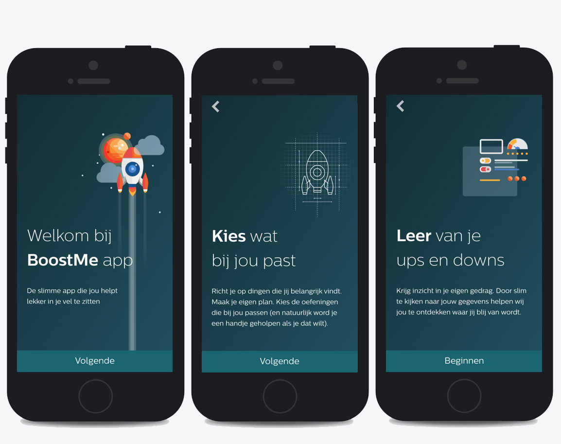
We had some visual designers in our team who captured the right spot. Make it dreamy but fitting to your needs and learn.
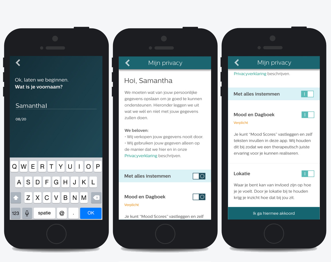
Make it like a conversation. Agree with what we want to do for the user.
The refinement
TESTING WITH USERS
We worked closely with our Usability Testing Lab to help define tasks, establish objectives and evaluate the app.
To ensure the test was realistic, we opted to use a real build of the application. This was prototyped in Axure Pro. Between the times spent recovering from bugs and app crashes we were able to find usability issues related to perceived affordances, layout, and search.
The feedback was clear:
People feel like the service is helping them, clinically. But… The navigation is “incomprehensible” and “chaotic”. It is not always clear what to do next. People would prefer to give a mood “number” more frequently and to be reminded more frequently to fill it in during the day.

Starting with the question: How is your day? Data entry and daily mood. Or do a quick exercise.

How are you doing? Is there any progress?

Choose a programm with a selftest.

Doing a quick exercise.

- Skills: Information architecture, Work Flow/Layout/Interaction Design, Visual Design, Web Design, User Interface design for mobile.
- Client: Philips Mental Health
- Project: App to prevent depression
- The tool used: Axure Pro
- Team: Projectleader, agile team of developers, visual designer UX lead, UX designer, UX researchers, health experts
- The tools used: User task flow charts, Axure