The Eidos app
Manatree team
OVERVIEW
A team of Altran experts going for luminous ideas to build, measure, and learn. The app can be plugged into the Toon by Eneco, the smart thermostat (2016). This smart thermostat tells you now (2020) everything about the energy consumption and how you can save.
MY ROLE
The team needed help with defining the target group. The idea was born earlier than there was a client. How to get a customer for this product. I did customer/UX research and customer development. As the app could be combined with the Toon, it was demonstrated to Eneco.
DURATION
At a given moment I was asked to join the group innovators, who were ready to take the next step in their project. As long as I was working at Altran they could find me, to do customer/UX research, UX tests make plans to get customers, work on presentations, and join the demonstrations.
THE CHALLENGE – THE APPROACH – THE DISCOVERY – THE FRAMEWORK – THE REFINEMENT
The challenge
By providing the energy consumer with options and information about energy sources, tariffs, alternatives, and usage, we hope to democratize the energy market.
The framework
Eidos Android application
The app displays the home appliances’ energy consumption information. People can monitor their energy consumption at home and possibly be more aware of energy usage.
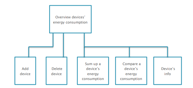
The UI structure of Eidos app is as follow:
The approach
LEAN UX
START VALIDATING WITH USER TESTS
In this round of user tests, we aimed to validate the usability perspective of the Eidos app.
We made the following hypotheses:
- To delete a device from the overview list, the long press + context menu is more efficient than the delete function from the overflow menu.
- The schedule chart can be easily found.
- People can understand the consumption chart and schedule chart.
- Regarding the comparison feature, people would like to compare the energy consumption between (1) the current week and the most efficient week, (2) the current week and the lowest efficient week, and (3) the current week and the same week of last month and last year.
8 participants attended the user tests, including 6 males and 2 females. They all have experience using Android phones. 2 participants out of 8 have the experience of using an energy consumption monitoring device at home.
Each user test session is less than 30 minutes. The user test was conducted by two observers/note-takers and one moderator.
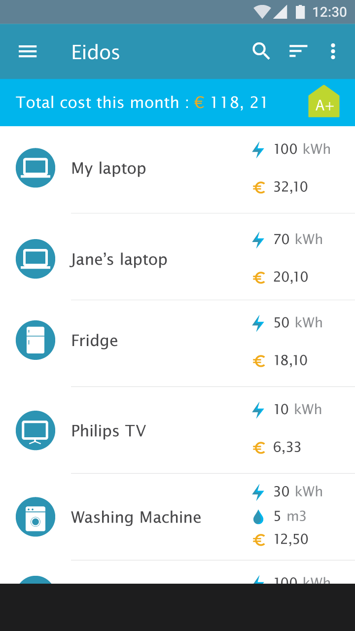
Overall UI
The user interface is friendly and clean. The device icons are simple and descriptive.
Test result:
Notations for price and energy consumption are not clear
The money value and energy values are not clear. Participants could not understand the meaning of values. The different guesses are: the value of money is the cost of energy consumption, the current usage of the device, or the price per hour. Some of them commented that instead of seeing kWh, they prefer to see the total energy usage of a device in a month.
Refinement:
- Eidos app should display real-time energy consumption. The price and energy consumption should be the accumulated value since the device is used. Besides, usage hours should also be displayed together with price and energy consumption.
- Using the energy consumption target is helpful for people to understand how much energy consumption is remaining for a device.
Test result: Ordering of devices
People would like to see the highest energy consumption device at the top of the list. Besides, some participants would like to see device information based on the rooms they are placed in. So they could notice irregular situations. For example, if they are not in a room often but this room uses a lot of energy, they can speculate something is wrong with the devices.
Refinement:
- the default order of the devices list should be energy consumption high to low. Besides, the app should provide sorting by room, by alphabetical order.
- In addition, visualizing the device energy consumption as a tree view gives a more straightforward impression on which device consumes energy most.
Result: Overall cost per month and energy label
People all noticed the total cost in a month in the top bar. They understood the energy label indicates the energy consumption level of their home.
Result: “Show device info” in the context menu is read-only
In the user test, participants were asked to edit the device name. On the overview page, the edit function is hidden. Participants looked around for the keywords “Edit device”. Most of them tried a long press+context menu. In the context menu, there is only “Show device info”. People have the impression that “Device info” can be read-only but not editable.
Refinement:
Add the “Edit” button to the “Device info” page.
Device summary page
When being asked to check the detailed information of the laptop, all the participants searched on the summary page by clicking the laptop row in the devices list.
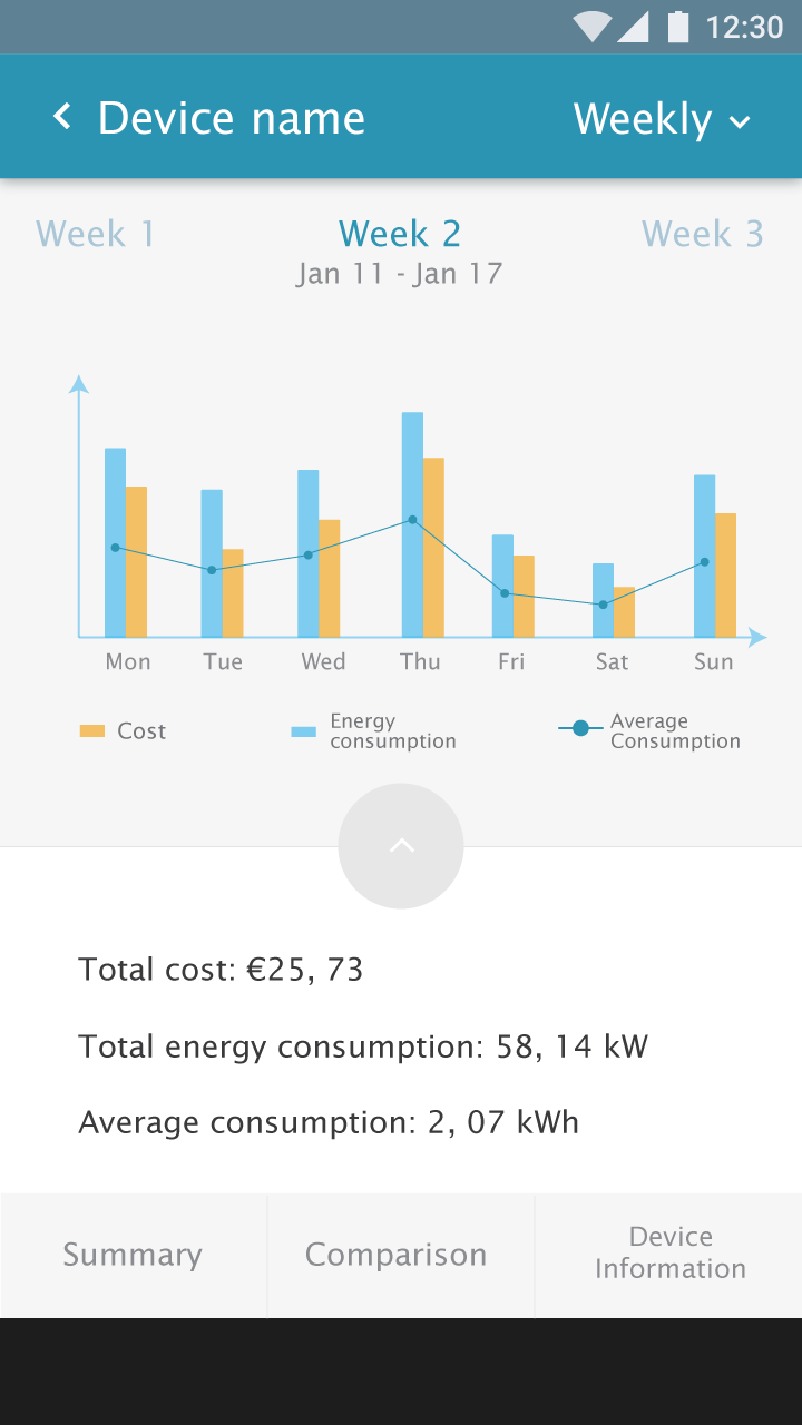
Test result: Consumption graph
Average energy usage for a day is not meaningful
The energy consumption graph displays energy consumption, cost, and average energy usage. Participants commented that the energy average of a day is not meaningful. Average for a long period is more interesting. They prefer to see an average of a month or a year.
Refinement:
The average energy consumption should be displayed in the monthly and yearly view, but not a weekly view.
Test result: Details are missed in the graph
As no unit indication on the Y-axis, participants could not understand the value of the bars. Participants would like to see more details of energy consumption for a day.
Refinement:
- the unit of price and energy consumption should be added to the graph.
- Users should be able to see more details from the consumption graph. Instead of showing a bar only, the graph should show details, e.g. energy consumption value, hours, cost when users dive in.
- The app should provide energy consumption estimation for the coming month of a year.
Test result: The swipe gesture was not clear when browsing among weeks
When being asked to check other week’s information, participants swiped on the graph or click on the week number to choose previous or next week.
Refinement:
The entire graph fragment should be able to be swiped. Besides, the previous week and next week should be clickable.
Test result: Irregular situation is more interesting
Participants expect to see the notification of something irregular, such as energy consumption is much higher than the average usage of last month.
Refinement:
Instead of showing only the data, the app should reflect the information behind it. The app can compare the current energy consumption with the average value. If the energy consumption of a device is suddenly irregular, the Eidos app should report this situation, and notify users.
Test result: Saturday and Sunday are not adjacent in the graph
When displaying the days of a week, Saturday and Sunday should be adjacent as they are weekend. It is easy to see the pattern of weekdays and weekends.
Refinement: Saturday should be next to Sunday.
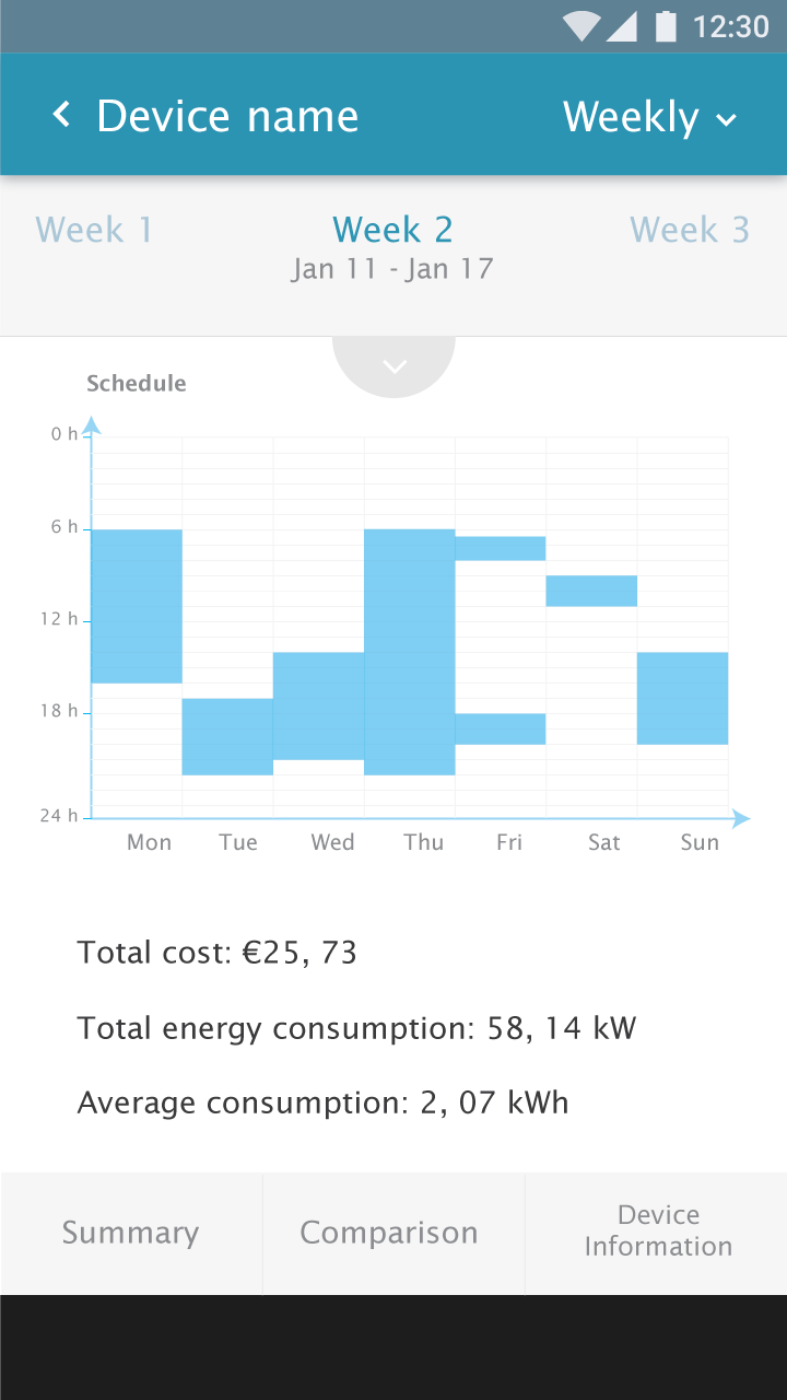
Schedule graph
Test result: More information
Participants expected more information from the schedule graph rather than only seeing the on/off status.
Participants are interested in knowing when the device is used in the peak hours (high price hours), Participants prefer to see the indication of the irregular situation from the schedule.
Refinement:
If the energy plan consists of peak hours, the schedule graph should use color to indicate the difference. Besides, if a device consumes energy unusually, the schedule graph should indicate it as well as give an explanation.
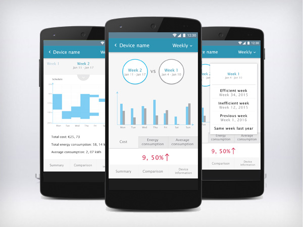
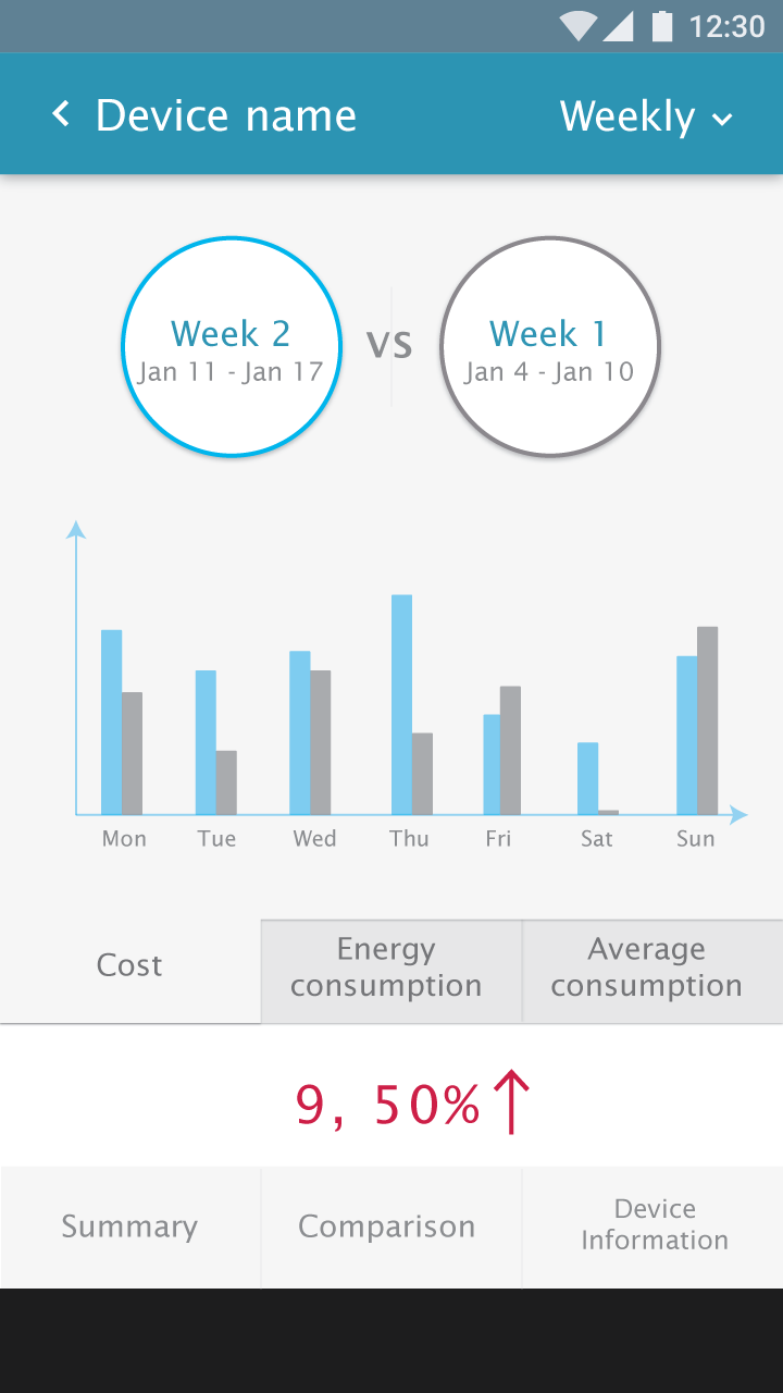
Device comparison page
Test result: The way of selecting weeks is understandable
Participants understood that they could select weeks by clicking on the Week A and Week B.
Test result: Feedback about visual design
The edge of week A and week B buttons are too thin.
Colorblind people may not easily see the difference between blue and dark grey.
Refinement:
- The connection of the week/month/year and its graph should not be built through color only.
- Regards the position of the current week/month/year, we should fix the current one so that users choose the contrast week/month/year.
Test result: Do not compare with the previous week
Participants would not like to compare the current week with the previous week. The comparison between the current week and the previous week does not mean a lot.
Participants think monthly or yearly comparison is more interesting than weekly comparison because the time interval of the weekly comparison is too short.
Refinement:
The monthly comparison should be the default comparison. Weekly comparison is still kept but not as the default display.
Test result: The meaning of the value below graph (9.50%) is not clear
Participants did not understand the meaning of 9,50%. They guessed it means a week’s energy usage is more than another week. But they could not tell which week is higher.
Besides, only showing increasing value is not sufficient. People want to know this information in terms of money because they are more concerned about how much they will pay less or more.
Refinement:
The app should use the descriptive way to present the increment or decrement of the energy consumption, as well as in terms of cost.
Device info page
Test result: Unexpected action
Pressing the “Enter” key after typing in the name field cannot remove the keyboard. It enters empty rows.
Refinement:
The “Enter” key should hide the keyboard.
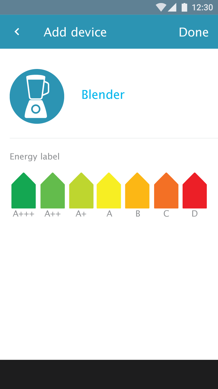
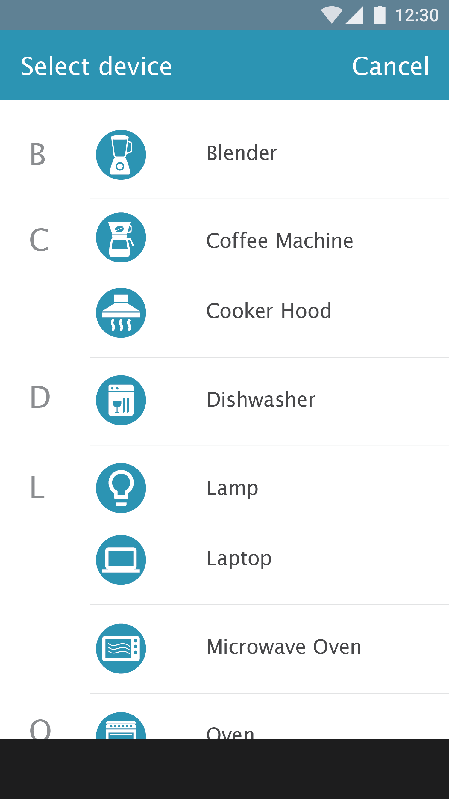
Add a device
Test result: No option for adding an unknown device.
Refinement:
Add the option of adding an unknown device.
Energy label: If a device is bought from another country that does not use the same energy level standard, people cannot decide the correct energy label. The application should provide the possibility to let the user type in the energy consumption value.
Refinement:
The app should provide both ways to input the energy consumption level: energy label option and manually type in.
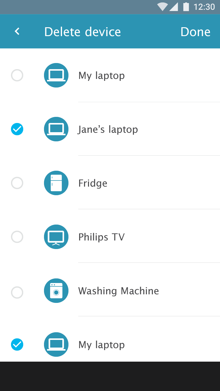
Delete a device
Test result: “Device info” page should have a delete function
When being asked to delete a device, participants looked for the delete button in the “Device info” page. As people can edit device information in the “Device info” page, it should also provide a delete function.
Refinement:
Add the delete function in the “Device info” page.
Test result: Long press + context menu is used more often
Most people used a long press+context menu to delete the device. Regarding the delete function in the toolbar overflow menu, a participant commented that it is too complex. However, deleting via the long press+context menu does not have confirmation dialogue. This should be corrected.
Refinement:
As there is little possibility to delete multiple devices at the same time, the delete function can be removed from the overflow menu, and the long press+context menu stays. And swiping + delete will be added.
Test result: The information of the deleted device is still useful
After a device is deleted, its information should remain available instead of being totally emptied. The old device information can be used for comparison with a new device or tracking the usage history.
Refinement: the deleted device information should be still stored in the system. Users can retrieve it (e.g. from history in the setting.).
Showing total energy consumption of the house
Test result:
Participants would like to see the total energy consumption information of the house/total devices. They also want to see the average energy consumption per device.
Besides, participants would like to compare the total house energy consumption.
Refinement:
The application should display the overall energy consumption of all the devices. Besides, people can compare the overall energy consumption between the current timeframe and the previous timeframe.
Test result: Showing device’s “On/Off” status
Participants would like to see the device “On/Off” status to monitoring the irregular situation of devices. One participant commented that with “On/Off” information she could be notified when the washing machine finished. So she does not need to go to the washing machine to check frequently.
Refinement:
Add “on/off” status indication to the device’s overview list. As an extra feature, add an option that the user can select to be notified if the state of a device changes.
OTHER IDEAS
During user tests, we received the following questions. They can be new features for the future.
1. A person has more than one residence. If he would like to monitor all of them within the same app, how will information be displayed?
2. The app shows monthly energy consumption. When to when is a month? (the app should be based on the billing period, as well as provide the option to user to customize a month. ). And customize the price they pay for energy. Besides, peak hour price and time should be considered.
3. Participants would like to compare their energy consumption with other users who have a similar situation (family size, house size, and so on). They want to know whether they are doing well or badly.
4. Remain the old device information. People can compare the old device with the new device.
INTERESTED CLIENTS
The team showed this app to Eneco during a workshop session Altran gave to a group of managers of Eneco. Because the app can be combined with their Toon application. In any case, the test results are interesting to them.